Author’s note: I’m building a museum! I’m working with the Washington State Jewish Historical Society to create a digital museum — essentially a way to showcase the organization’s vast troves of historical content while engaging new audiences to explain how such an organization benefits its local community. This is Episode IV (A New Hope…ahem) in a multipart series.
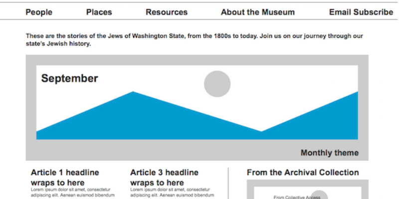
Now the fun begins. Following my survey analysis, I’ve got an idea of what I actually need to build, and I can start figuring out what the site will look like! But I’m not starting with design. First come the wireframes. In layman’s terms, for those of you non-user experience folks, a wireframe is like a blueprint on a building. In this case I’m using an app specifically intended to build these wireframes, with interactive elements so when I show my client it’s easy to click through from one page to the next.

But before I do even that, I pull out the whiteboard. Yes, user experience architecture is, at its core, decidedly low fidelity. As it should be. It’s a heck of a lot easier to come up with an idea, draw it out in dry erase, then wipe it all away if it doesn’t work. Once you’ve got an architecture that works, transposing it to the software (Axure in my case) takes much less time.
This is also the point where I begin to work on the information architecture. You think of them as simple menus or sitemaps, but they require a lot of thought to make them that way. I need to consider How many menus, what goes in them, and what to call each item. As my User Experience professor once said, the optimal number of menu items is zero. But you also have to account for reality.
In this project, the concept of People, Places, Things popped out at me. But I doubt that people are going to look at a menu called Things and want to click on it, so I had to do a little refining.
In the end, it’s easier to reorganize menu items than a site design, but the information architecture and the wireframes should still be almost cemented by the time you fire up Axure.
Then, at some point, that architecture becomes God.
Really. Everything that comes after—the visual design, the content, the site development—is based on those wireframes. So you’d damn well better do it right or people will come to your gorgeous site and have no idea what to do next.
So here’s what I came up with, version 1:

But then, as I worked through my first iteration, controversy erupted. The lay leader who pushed through the idea to get this entire digital museum effort going had a very different vision of the way he wanted the site to look. I made my case. He made his. I went back to the drawing board. I built wireframes based upon his initial design, with some changes as I thought through what would and would not work in that architecture.
Still, not good enough.
Lesson learned? Just a reminder that one UX expert’s solution will be different from another’s. Every. Single. Time. And what I might think is best, after making plenty of sausage, inevitably will not end up as the final product. And, finally, I need to remember that the people I’m advocating for are the ones who will be using this product.
Eventually staff leadership made the decision that we should iterate on the design based on version 1, and that’s the direction we’ve gone.
So what’s this thing going to look like? I’ll give you a hint: I’ve been behind on my blogging, so if you were to visit https://www.washingtonjewishmuseum.org, you might find out.
Joel Magalnick is the founder of The Refined Story, a content marketing and strategy agency, and holds a Master of Communications in Digital Media degree from the University of Washington’s Communication Leadership program. Talk with him today about how he can help you grab hold of your editorial potential.


